Increasingly, academic staff need to be able to create a variety of learning resources for students in the form of PowerPoint Presentations, Videos, Multimedia Presentations, Handouts or Online Courses. The question is, what can you do to design more effective learning resources to help students learn? Well, Richard Mayer back in 2009 pondered this question and after extensive research, developed the 12 Principles of Multimedia Design. Applying these principles will help you to create more effective learning resources to better support student learning:
Mayer’s 12 Principles of Multimedia Design
- Coherence Principle: People learn better when extraneous words, pictures, and sounds are excluded.
- Signalling Principle: People learn better when cues, such as headings, bolding keywords, circles, squares, arrows or colour highlight the organisation of essential material.

- Redundancy Principle: People learn better from graphics and narration than from graphics, narration, and on-screen text.
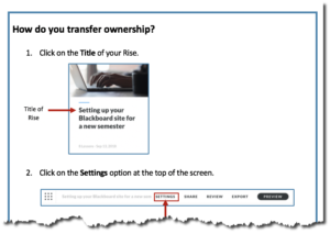
- Spatial Contiguity Principle: People learn better when corresponding words and pictures are presented near rather than far from each other on the page or screen. The example below demonstrates this principle. Which is easier to understand? Drag the slider to see the full image.
- Temporal Contiguity Principle: People learn better when corresponding words and pictures are presented simultaneously rather than successively.
- Segmenting Principle: People learn better when a multimedia lesson is presented in a user-paced segment rather than as a continuous unit.
- Pre-training Principle: People learn better from a multimedia lesson when they know the names and characteristics of the main concepts.
- Modality Principle: People learn better from graphics and narration than from animation and on-screen text.
- Multimedia Principle: People learn better from words and pictures than words alone. Try it for yourself. Which example makes it easier to understand the concept? Drag the slider to see the full image.
- Personalisation Principle: People learn better from multimedia lessons when words are in a conversational style rather than formal style.
- Voice Principle: People learn better when the narration in multimedia lessons is spoken in a friendly human voice than a machine voice. Why don’t you be the judge of this? View the video below, which has two short video extracts. Which version makes it easier to learn and understand?
- Image Principle: People do not necessarily learn better from a multimedia lesson when the speaker’s image is added to the lesson.
